Our old friend Drew Stewart—who is a longtime Digital Bits reader—is the webmaster for Star Wars Revisited and also curates the Star Wars Visual Comparisons blog.
He’s been working diligently to create a kind of visual guide to all the changes found in the recent Disney+ 4K version of Star Wars: Return of the Jedi.
Drew’s created a set of comparison images showing all of these updates and alterations—39 of them in all—and he’s kindly allowed us to compile them here in a 7-page gallery on The Digital Bits for all of you to see.
We definitely think that Star Wars fans will find this gallery both interesting and useful, not just to compare the new Disney+ 4K version to past Blu-ray and DVD releases, but also as a baseline in the event that further changes appear in the future. [Read on here...]
With all of this in mind, here’s a look at the differences that Drew has spotted thus far...

A new Fox logo without the “News Corp” banner was created.

The Disney-era LFL logo has replaced the 1990s-00s one (even though its timing doesn’t really work with the Fanfare).

The preface was replaced with the Attack of the Clones preface in 2004, and now is back to the original.

The 2011 Blu-ray introduced an expanded entrance to Jabba’s Palace. This 3D change was also done in 4K, but cropped differently for some reason. (This new shot makes the door three times larger on the outside than the inside)

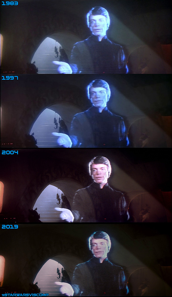
This is a comparison of the different home video versions of Luke’s hologram. It’s unknown if these are legitimate changes or results of different scans.


